
|
Waiting21.59cm x 22.23cm
Watercolor November 2020 Waiting is a watercolor piece inspired by landscape illustrations done by Juliet Percival. The piece shows the feeling of waiting for things to change, but never taking action to make those changes happen. |
Planning
Inspiration

|
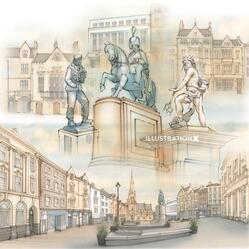
Theme The theme of the piece focuses on the idea of being dissatisfied while at the same time not taking action to better it. I wanted to capture the feeling of waiting for things to change, but never taking the steps to make those changes happen. I tried to show this feeling through symbolism in my piece. In the piece I used the bus stop to symbolize the idea of constantly waiting. The person with their eyes closed emphasizes the fact that no action is taken while she nods off. I wanted to use the colors to emphasize a rainy and dreary feeling. I did this by using purple and having the colors look hazy and flow past the lines of the objects of the piece.
|
Planning Sketches
|
When brainstorming ideas for my piece I had two ideas for what I wanted to do with the background. One approach I had was that I could create a piece with a city landscape in the background with things such as a concrete ground, barb wire fencing, and utility poles. My second idea was to create more of a rural scene adding trees, plants and other natural elements. I made thumbnail sketches of both and ultimately decided that although the more industrial take emphasized a dreariness to the piece, I felt that I could add much more detail to a piece that incorporated nature giving it more depth.
|


Experimentation
|
One thing I experimented with was whether or not I should use lineart before or after I lay down my water color. I first started by testing using pen overtop watercolor on the left side. I painted a swatch of my watercolor and three shapes. Once the paint was dry I tested my pen overtop the watercolor and outlined the shapes I created. On the right I started by testing my pen and drawing outlines of shapes. After I left the pen to dry I painted over my pen tests and filled in each of the outlined shapes. I found that when I used the water color before the lineart it made it hard to perfectly draw the lines around the already painted shapes. I also found that when using the pen over the paint it seemed to be slightly drying out the pen and would cause the nib to become clogged. When using the watercolor over the pen I found that it slightly dulled the darkness of the lines, but I thought that I could maybe use this to an advantage in my piece because it could make everything look more unified. Doing this also helped for things to be more precise as it was much easier to fill in already defined shapes with paint. For my final piece I decided to ink the piece before I used the watercolor.
|

|
Process
I first started by turning the idea I chose from my planning sketches into a final cleaned up sketch. When doing this I used a set square and a ruler in order to make sure my lines were straight and to make sure the perspective of my piece stayed consistent. When I finished my sketch I began to ink my lines using a 0.5mm pen. I tried to keep my line work fairly consistent similar to Juliet Percivals linework. I let my lineart dry overnight to avoid any chance that the lineart could smudge or smear once I began to use the watercolor. When it came to figuring out my colors for the piece I first started by swatching all the colors of paint that I had. After that I mixed colors for two different color palettes. The first set of colors consisted of nature based colors such as green, brown and yellow. The second set of colors I chose included tones of purple, yellow and gray. Ultimately, I decided that the second set of colors were better fit to communicate my idea. I also thought the second set of colors was closer to the way that Percival portrayed lighting in many of her pieces. She often offset the cooler tones in her pieces with bright yellow to create contrast. Once I had finished my watercolor, I used colored pencils to darken some areas in order to help certain things stand out.


|


|


|


|
Reflection
Critique
Overall, I enjoyed working on this project. In retrospect, I wish I would have done my final sketch lighter, because even when it was erased after I did my linework it was still slightly visible. This made it hard to cover up with a translucent paint like watercolor. One thing that I found very interesting was the technique of breaking the limitations of the lines with color and not focus on the individual color of each object.
Compare & Contrast

|
Similarities
-Both Percival’s and my piece use consistent line weight in the lineart. -My piece and many of Percival’s pieces use a limited color palette. -Similarly to Percival’s pieces, my piece blends watercolors together past the defined lines. -Both my piece and Percival’s piece contrast cool colors with warm colors. -Both my piece and Percival's are city landscapes. Differences -Unlike Percival’s work, I choose to include a character in my piece. -My illustration tells a story unlike Percival’s work that is based in factual representation of a realistic scene. -Percival’s work has been created for the purpose of reference in books and brochures where my art is an individual piece. |
|
ACT Responses
1. Clearly explain how you are able to identify the cause-effect relationship between your inspiration and its effect on your artwork.
Percival's work inspired my use of line work and my use of color not being confined by those lines. Her work also directly inspired my use of contrast between cool colors with warm colors.
2. What is the overall approach the author has regarding the topic of your inspiration?
The authors of the research on Percival presented information from either an objective perspective or an admiration of the artist.
3. What kind of generalizations and conclusions have you discovered about people, ideas, culture, etc. while you researched your inspiration?
One conclusion that I discovered is that Percival’s approach to illustrating medical and scientific reference books is much different from other illustrators. Percival is unique in the fact that her interest in the human body caused her to get a degree in Physiology. It was after that, that she applied this interest to illustrations.
4. What is the central idea or theme around your inspirational research?
One main theme in the research on Percival is that her art revolved around bringing beauty and personality to the traditionally cold and clinical illustrations in most medical reference books and brochures.
5. What kind of inferences did you make while reading your research?
One inference I could make while researching Percival is that her art was very unique to her field. Percival adds beauty and personal elements to her work, while others who create commercial art are more factual.
Bibliography
Exclusively Representing Juliet Percival. IllustrationX. (2012). Retrieved from www.illustrationx.com/us/artists/JulietPercival.
Fowlers Yard. Creative workspace: Juliet Percival. (2012). Retrieved from https://www.fowlersyard.com/juliet-percival.html.
Juliet Percival: Friends Action North East. (2012). Retrieved from https://www.friendsaction.co.uk/locations/juliet-percival.
Fowlers Yard. Creative workspace: Juliet Percival. (2012). Retrieved from https://www.fowlersyard.com/juliet-percival.html.
Juliet Percival: Friends Action North East. (2012). Retrieved from https://www.friendsaction.co.uk/locations/juliet-percival.
